
Case Study
Document Management System
it is an DMS for electronic document management that enables performing office tasks, documenting the handling of cases, and collecting and creating electronic documents.
Company
EZD RP
2024
Contribution
Product Redesign
Team
Przemysław Budziło (Lead Designer)
Piotr M. (Support Designer)
Dorota Sz. (Owner)
Kamila Ch. (Owner)
Rafał N. (Front-End)
Krzysztof Cz. (Front-End)

Context
Redesign of the DMS to optimize employee workflow and improve document flow
In March 2024, I embarked on a journey with EZD RP as a UX/UI designer at NASK-PIB, leading the redesign of the document exchange software used by tens of thousands of employees in public institutions and private companies. The main challenges included time constraints, the absence of project files (the software was entirely hard-coded), and a steep learning curve in a new industry. I meticulously documented and shared my work through active communication and regular feedback with teams and developers to overcome these challenges. These efforts effectively resolved a key issue with the tool, significantly increasing team productivity and scalability for future capabilities.
My Roles
– Advanced core user flows, the tool information architecture, and user interface consistency and scalability through design systems.
– I carried out tasks such as identifying problems, defining problem scopes, designing solutions and supervising the implementation process.
– Building a Design System, being responsible for development and updating along with documentation and active communication with teams and programmers to standardize knowledge.
– I Executed the tasks such as identifying issues, defining problem scopes, prioritizing tasks, designing solutions, conducting testing, and overseeing the implementation process.
Project Impact
– Increased team productivity
– Comprehensive documentation
– Streamlined Dev + Design process by creating a Design System
– Improved document management process
Understanding
Redesign of the DMS to optimize employee workflow and improve document flow
I frequently met with key stakeholders to understand how the existing and implemented system looks and functions. The document management system is used by tens of thousands of employees every day, both in large teams and small groups, who report numerous difficulties and needs. This involves a large number of repetitive tasks in their workflow. Therefore, the main goal was to enhance the tool’s efficiency and readability.

The tasks and
Team’s Journey
After thoroughly exploring the system, I defined the scope of the redesign project that was feasible within the given timeframe. Considering the tight schedule, we strategically prioritized tasks and adjusted the scope as new needs or changes arose. To ensure effective collaboration with the team, I created a journey map, which we focused on initially.

The tool, Document Management Tool
The Document Management System plays a crucial role in helping users quickly identify, track, and analyze documents while maintaining clarity in the history of object and document circulation. However, the current tool has revealed significant usability issues within workflow processes. The primary goal of the project is to strategically address these issues.
Before

After

Project Goal & Scope
Keep the team’s work flowing and increase efficiency while making the tool scalable and user-friendly

Implementation & Feedback
You are making this
really user-friendly!
The redesigned sections were developed in close collaboration with the team of developers, enabling rapid implementation by stakeholders to address any unforeseen issues. Building a Design System and standardizing components while reducing their variants enhanced the efficiency of the entire process.

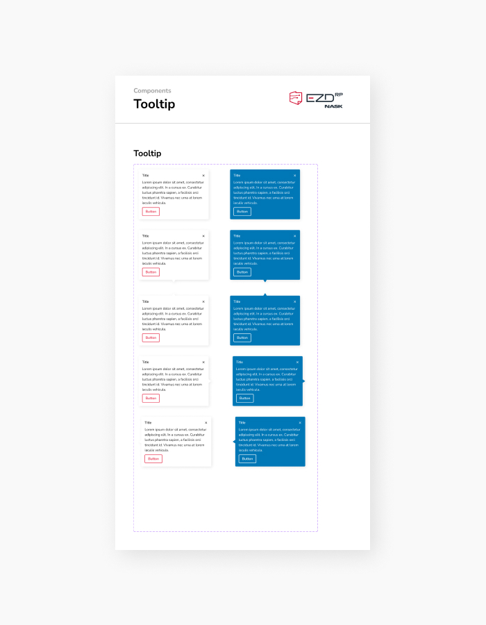
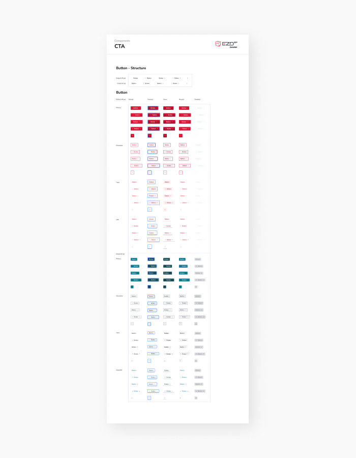
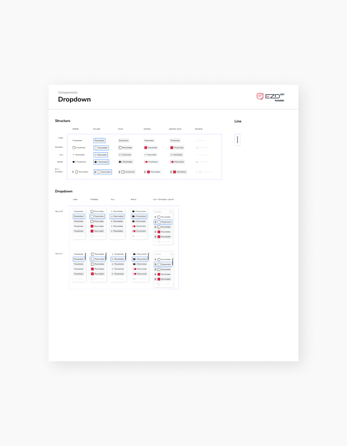
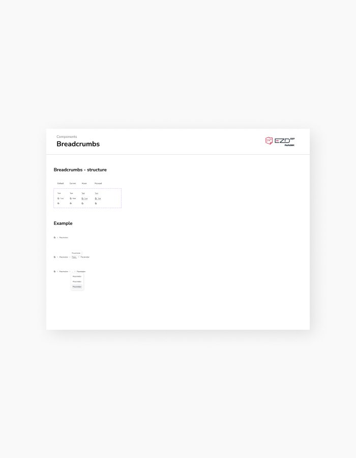
Project Task 1
Designing a Design System to streamline component development and unify the UI

Problems
The absence of a Design System led to unclear UI elements and inconsistent actions, hindering users from quickly identifying functionalities
The lack of a Design System resulted in undocumented processes, causing developers, business stakeholders, and designers to recreate the same elements repeatedly. This led to inconsistencies in functionality and visual appearance, creating ambiguity in operation. Given that users performed these tasks repeatedly during their shifts, it became necessary to rethink the UI and the scope of required features. This involved developing as needed and within technical capabilities.

Approach
UI consistency and clarity of operationy
The goal is to enable developers, business stakeholders, and designers to navigate components easily without unnecessary interactions by providing clear guidelines and documentation. Support is provided in case of ambiguity, and updates are made to the documentation as needed.


Design Decision
Building the Design System from scratch while simultaneously changing the project’s UI
While working on the Design System, I encountered several challenges, such as temporary functionalities, context-dependent tabular actions based on roles and permissions, fields varying by user type and context, extreme character limits in fields, and diverse usage across different entities depending on document and object workflows. This resulted in a wide array of document and object flow variations and a need for detailed tracking of their processes.
In response, I familiarized myself with the system’s operations step by step, building the system while simplifying and standardizing typography and UI. This approach proved to be a user-friendly choice.
The decision to build the Design System was pivotal at the outset of my collaboration with EZD RP. It addressed the initial challenges of slowing down mock-up designs while aiming to save time in building subsequent elements and accelerating progress.


Project Task 2
Redesigning the Monitoring View to improve object and document search and browsing


Problems
Unclear user interface elements and inconsistent actions hinder users from quickly identifying information, resulting in repetitive interactions
Unclear information in the Monitoring view led to inefficiency, as users frequently switched back and forth to access details. Given that users perform this task repeatedly during their shifts, it became necessary to rethink the purpose of Monitoring, the presentation of data, and the scope of required functionalities within it.

Approach
Ambiguous designation of whether the user is in the „To Do” or „Monitoring” section. Clarifying that „Monitoring” serves a different function than „To Do.”
The goal is to enable users to navigate the object and document preview effortlessly, making informed decisions without unnecessary interactions. This is achieved by providing clear guidance in the Monitoring view to distinguish between objects and documents, including personal and status details.

Design Decision
Searching and browsing objects and documents based on user preferences and navigation
While working on the Monitoring view, I encountered another challenge: effectively filtering objects and documents, which significantly impacted the overall search experience. In response, I explored various options, tested them, and implemented a system of segmented filtering into basic and advanced categories, which proved to be the most user-friendly choice.
However, limited screen space, primarily due to the sidebar navigation, and the lack of knowledge about user screen resolutions posed additional obstacles. To address this limitation, I consolidated information presentation and restructured navigation by reducing the number of columns in the table to essentials with an option for users to edit them. I also evaluated the intuitiveness of icons in the design and provided action descriptions anticipating non-standard actions.


Project Task 3
Designing the mobile view for „To be Handled” to enable signing and accepting documents from any device


Problems
Inability to browse, edit, sign, and accept documents from any device
The inability to sign and accept documents via mobile devices led to inefficiencies and difficulties in document workflow, as users were unable to work on them outside of desktop and laptop environments. Given that users perform these tasks repeatedly during their shifts in various environments and situations, it became essential to introduce the capability to work on objects and documents, while carefully considering the scope of required functionalities on every device.

Approach
Lack of ability to view, edit, sign, and approve documents from any device
The goal is to enable users to navigate the „To be Handled” view easily and make informed decisions without unnecessary interactions. This will be achieved by providing clear guidance to distinguish between objects and documents, including personal and status details. Additionally, the scope of required functionalities will be carefully considered to ensure usability on mobile devices.

Design Decision
Need create mobie view „To be Handled” with integrated an effective filtering system and restructured navigation, consolidating information
While working on the mobile view of „To be Handled,” I encountered another challenge, including effective filtering of objects and documents, as well as presenting key functionalities, significantly impacting the overall user experience. In response, I explored various options, tested them, and integrated a system that proved to be the most user-friendly choice.
However, limited screen space posed an additional obstacle. To address this limitation, I consolidated information presentation and restructured navigation by reducing the number of columns in the table to essentials, with an option to expand for a full list of object and document circulation details, along with information that users can edit them. I also evaluated the intuitiveness of action icons in the design.


Project Task 4
Redesigning the Dashboard view to streamline content delivery and unify the UI under the Design System
Before


Problems
The increasing demand for new widgets in a limited space, coupled with a large volume of content editable by users
The limited space caused inefficiencies and readability issues while needing to add elements such as Activities for object and document workflows. Given that users perform these tasks repeatedly during their shifts, it became necessary to introduce customizable Dashboard editing capabilities tailored to each user’s needs.

Approach
Interview to determine information priorities and effective consolidation
The goal is to enable users to navigate the Dashboard easily and make informed decisions without unnecessary interactions by providing clear guidance for displaying and editing content based on user preferences. This involves carefully considering the scope of required functionalities.


Design Decision
Tracking information, editing capabilities, and profiling according to user needs
While working on the Dashboard view, I encountered several challenges: scalable limited space, varying importance of information among users, future widget development, and presenting key action functionalities, all of which significantly impacted the overall user experience. In response, I explored various options, tested them, and integrated a system that proved to be the most user-friendly choice.
However, the main obstacle remained the limited screen space. To address this limitation, I consolidated information presentation and restructured navigation by adding options to enable/disable widgets, tabs for different dashboards, widget rearrangement, and editing capabilities for selected widgets. This allowed users to edit and customize widgets according to their needs and the available screen resolution they were using.
I also evaluated the intuitiveness of action icons in the design and the steps required to access necessary functions and tools that users need.

Impact
Success Metrics
& Result
Finally, the ultimate goal of this project was to improve the workflow of objects and documents. Unfortunately, I didn’t establish specific success metrics since the system doesn’t collect statistics. However, the positive feedback from internal NASK users who tested the prototype and external users who were the first to receive the tool update is truly encouraging.
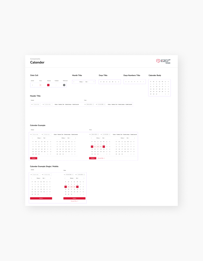
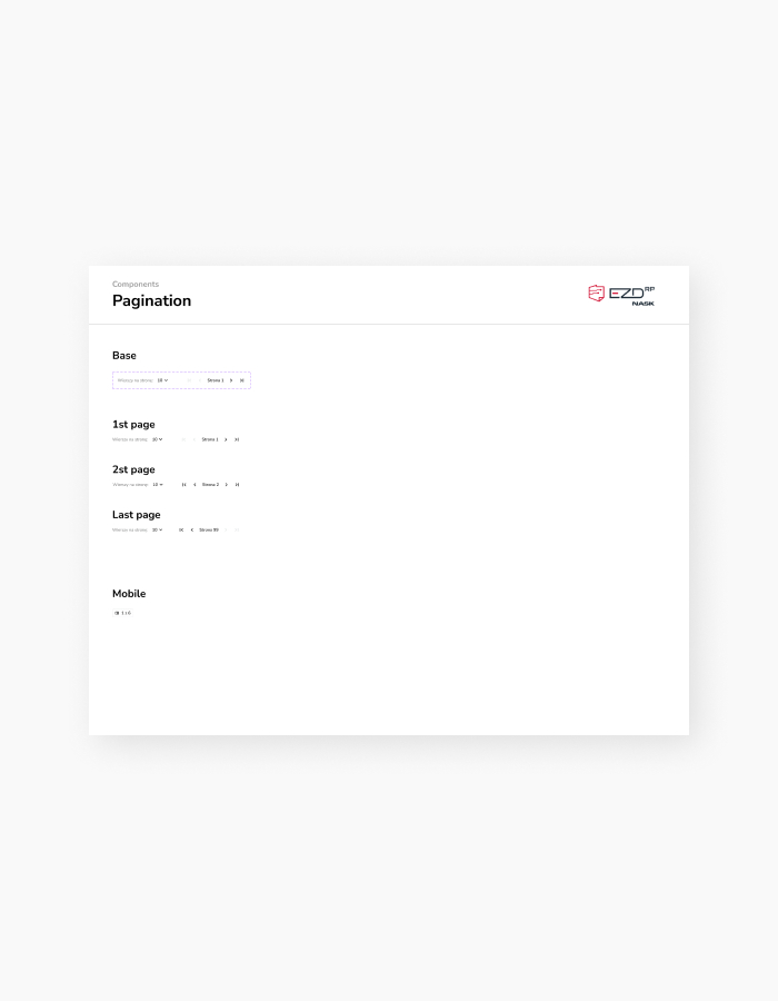
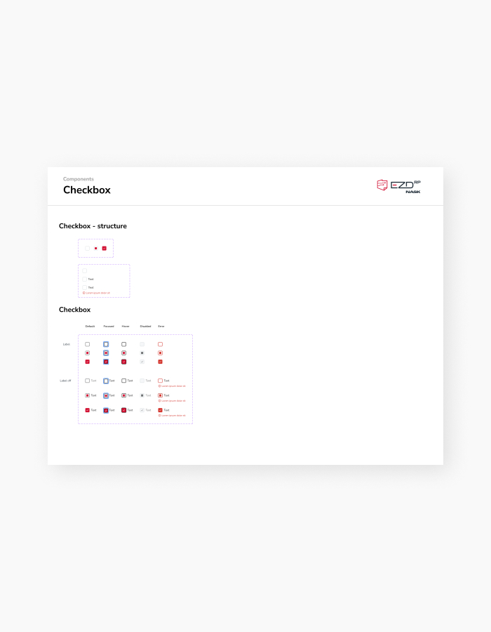
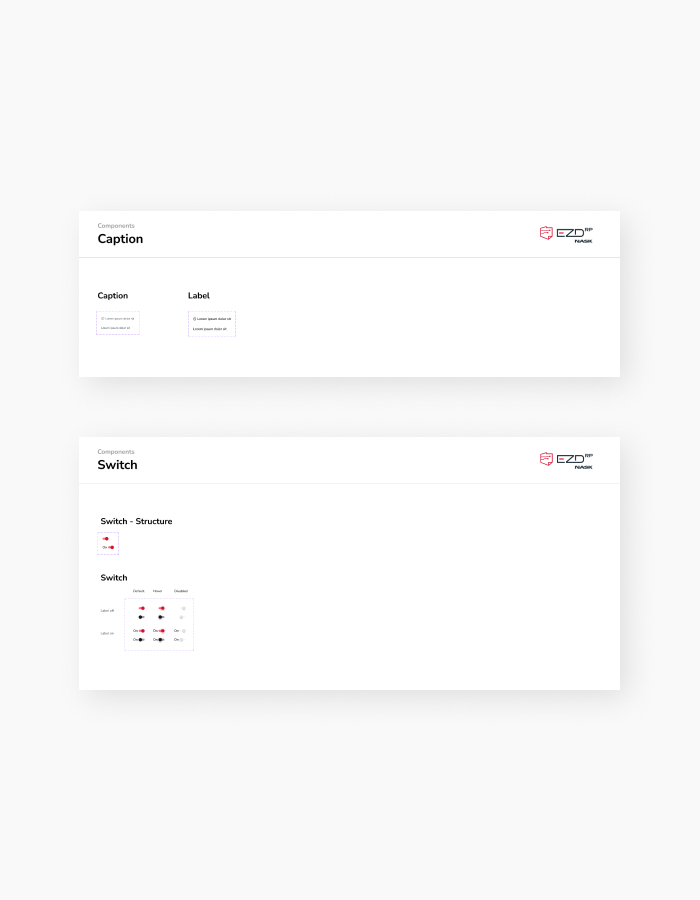
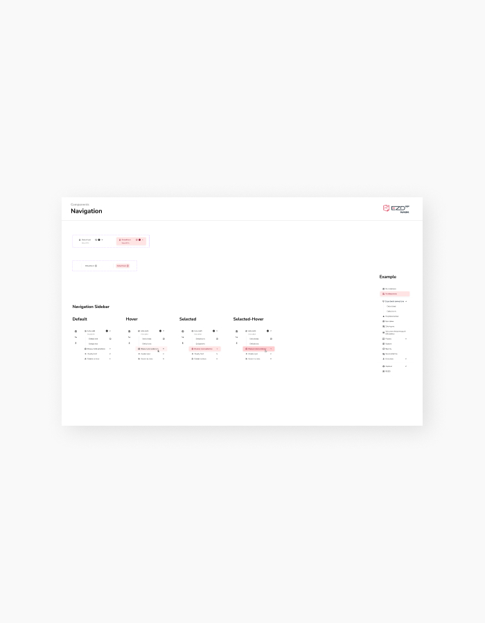
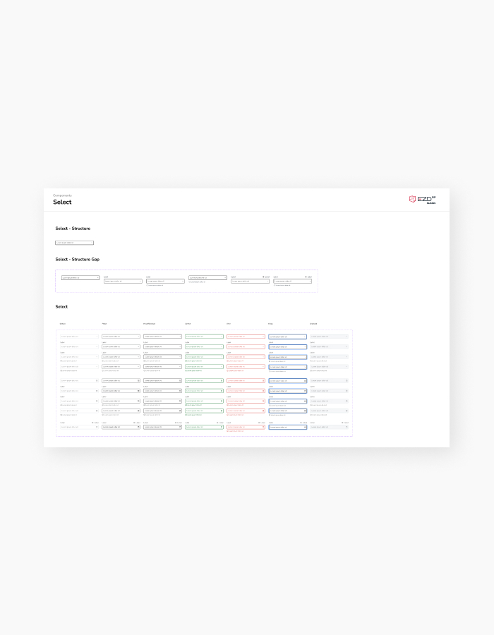
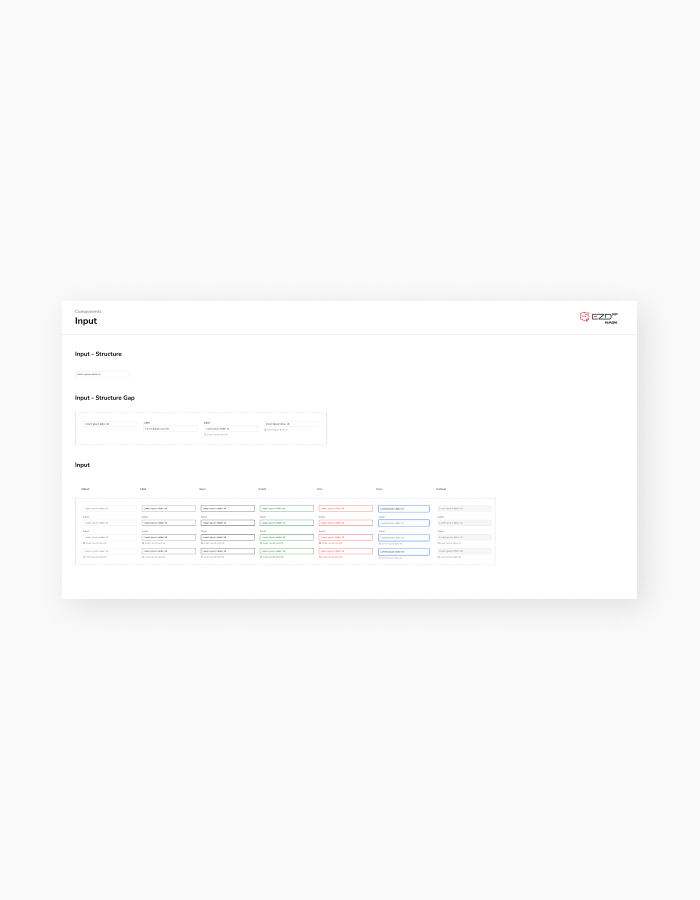
Design System
Thinking systematically with scalability in mind streamlines the design and programming process
When I started this project, there were no project files available—only isolated mock-ups lacking consistency—because the tool was entirely coded. Initially, I hesitated to invest time in building a Design System as it could potentially extend the project schedule. However, I couldn’t overlook the importance of a Design System for programming efficiency, UI consistency, and future scalability.
I decided to partially leverage the existing design system being developed for NASK overall, making modifications to tailor it to the tool’s requirements. Fortunately, this approach proved successful. The design system addressed many potential questions for developers by clarifying how individual functions should operate and behave.

As We Conclude…